
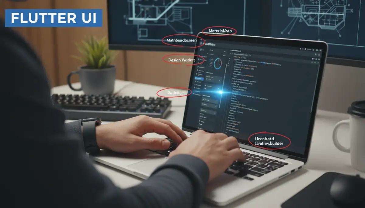
Mastering Flutter Design Widgets: Your Ultimate Guide for 2025
Welcome to the exciting world of Flutter development! In 2025, building beautiful and functional applications is easier than ever, thanks to Flutter's powerful toolkit. At the heart of every Flutter application are its intuitive and versatile flutter design widgets. These are the building blocks that let you craft engaging user interfaces across mobile, web, and desktop platforms. Understanding how to effectively use and combine these widgets is crucial for any developer aiming to create top-tier applications. This guide will walk you through everything you need to know about flutter design widgets, from the basics to advanced techniques, ensuring your apps stand out.
What Exactly Are Flutter Design Widgets?
In Flutter, everything is a widget. Seriously, everything! From a simple button to a complex layout structure, it's all a widget. Think of widgets as blueprints for your app's user interface. They describe what your app's view should look like given its current configuration and state. When you combine many flutter design widgets, you create your app's entire visual experience. This widget-based approach makes UI development incredibly flexible and efficient.
Each widget has a specific purpose. Some widgets handle layout, like `Row` and `Column`. Others display content, like `Text` and `Image`. Still more handle user interaction, such as `ElevatedButton` or `TextField`. The beauty of flutter design widgets lies in their composability. You can nest them within each other to create intricate and responsive designs. For a deeper dive into how widgets define UI, you can read more about the UI-definition of a Widget and its build() function.
Stateless vs. Stateful Flutter Design Widgets
Before we dive into specific flutter design widgets, it's essential to understand the two fundamental types:
- StatelessWidget: These widgets do not change over time. They are immutable. Once they are built, they stay the same until they are rebuilt with new configuration data. Examples include `Text`, `Icon`, and `Image`. Think of a static label on a screen.
- StatefulWidget: These widgets can change their appearance dynamically. They have mutable state that can change during the lifetime of the widget. This state can be user input, data fetched from a network, or animations. Examples include `Checkbox`, `Slider`, and `TextField`. Imagine a counter that increments when you tap a button.
Choosing the right type is crucial for performance and maintainability. You will use both extensively when building with flutter design widgets.
The Foundation: Material Design and Cupertino Widgets
Flutter provides two comprehensive sets of flutter design widgets that implement popular design languages. These are Material Design and Cupertino. They help you create apps that look and feel native on Android and iOS, respectively.
- Material Design Widgets: These widgets follow Google's Material Design guidelines. They offer a rich set of components with a distinct visual language, motion, and interaction. They are perfect for creating modern, consistent UIs across platforms. You can explore a vast catalog of Flutter's material component widgets to see their capabilities.
- Cupertino Widgets: These widgets mimic Apple's iOS design language. They provide an authentic iOS look and feel, including navigation bars, tab bars, and switches. Using Cupertino widgets helps your app blend seamlessly into the iOS ecosystem.
Most developers start with Material Design due to its extensive library and cross-platform appeal. However, you can mix and match or conditionally render widgets based on the platform. This flexibility is a key strength of flutter design widgets.
Essential Layout Flutter Design Widgets
Layout widgets are the backbone of your app's structure. They help you arrange other flutter design widgets on the screen. Mastering these is fundamental to creating visually appealing and organized interfaces.
Rows and Columns: The Core of Linear Layout
`Row` and `Column` are two of the most frequently used flutter design widgets. They arrange their children either horizontally (`Row`) or vertically (`Column`).
- Row: Lays out children in a horizontal line. You can control their alignment along the main axis (horizontal) and cross axis (vertical).
- Column: Lays out children in a vertical line. Similar to `Row`, you control alignment along the main axis (vertical) and cross axis (horizontal).
These widgets are highly customizable with properties like `mainAxisAlignment` and `crossAxisAlignment`. These properties dictate how children are spaced and aligned within the row or column. They are crucial for precise control over your flutter design widgets.
Container: The All-Purpose Box
The `Container` widget is incredibly versatile. It can hold a single child widget and apply various styling, painting, and positioning effects. Think of it as a customizable box. You can set its width, height, background color, padding, margin, and even add borders or shadows. It's a go-to for wrapping other flutter design widgets and giving them a distinct appearance.
Stack: Overlapping Widgets
When you need to layer widgets on top of each other, `Stack` is your friend. It places its children one on top of the other, from bottom to top. This is perfect for creating overlays, badges, or complex background effects. For example, you might place text over an image using a `Stack` of flutter design widgets.
Padding and Center: Simple Spacing and Alignment
`Padding` is a simple yet powerful widget. It adds empty space around its child. This helps improve readability and visual hierarchy. Similarly, `Center` simply centers its child widget within the available space. Both are fundamental for fine-tuning the look of your flutter design widgets.
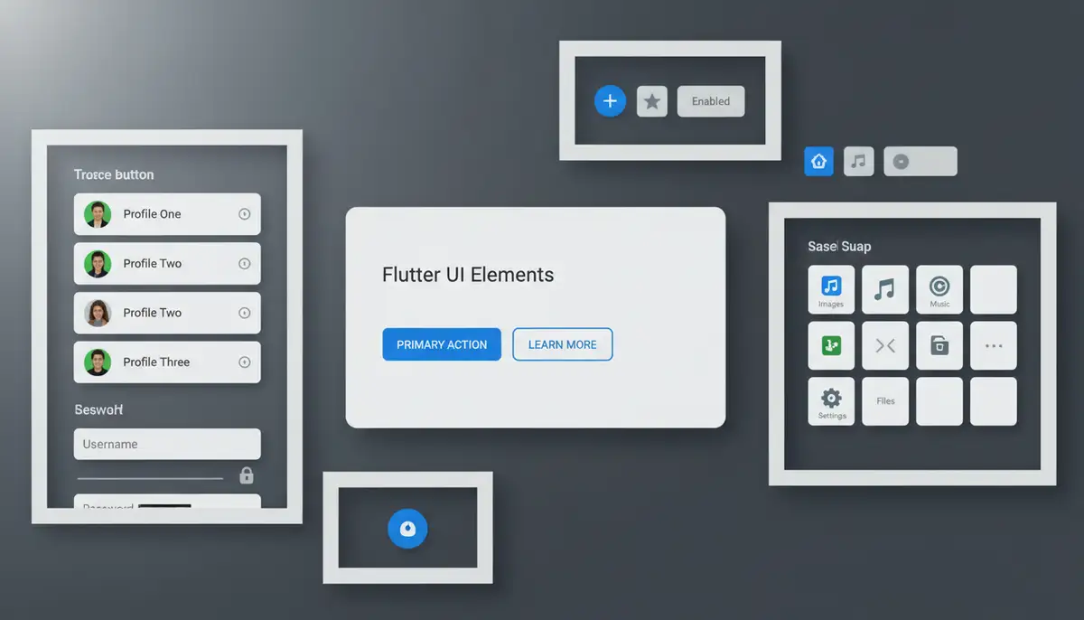
Essential UI Flutter Design Widgets
These are the widgets that users directly see and interact with. They form the core visual elements of any application built with flutter design widgets.
Text, Image, and Icon: Displaying Content
- Text: Displays a string of text. You can style it with different fonts, colors, sizes, and weights using `TextStyle`.
- Image: Displays various types of images, including assets, network images, or files. It's essential for visual appeal.
- Icon: Displays graphical icons. Flutter comes with a vast library of Material Design icons, and you can add custom icons too.
These foundational flutter design widgets are used in almost every application. They are the primary way to convey information and visual branding.
Buttons: User Interaction
Buttons are critical for user interaction. Flutter provides several types of button flutter design widgets, each with a specific use case:
- ElevatedButton: A Material Design button with a shadow that 'lifts' off the surface. Ideal for primary actions.
- TextButton: A flat button that responds to touches with a ripple effect. Good for less prominent actions.
- OutlinedButton: A button with a thin border. Useful for secondary actions or alternatives.
- IconButton: A graphical button that displays an icon. Perfect for small, clear actions like 'delete' or 'add'.
Choosing the right button style improves user experience. Consider the prominence of the action when selecting among these flutter design widgets.
TextField: Inputting Information
The `TextField` widget allows users to input text. It's highly customizable, supporting various input types (numbers, email, passwords), styling, and validation. It's a cornerstone for forms and data entry in any app built with flutter design widgets.
Interactive and Form Flutter Design Widgets
Beyond basic buttons and text fields, Flutter offers a rich set of interactive widgets. These allow users to manipulate data and settings within your application.
Gestures and Taps: GestureDetector and InkWell
Not every widget has built-in tap detection. `GestureDetector` and `InkWell` are powerful flutter design widgets for making any widget interactive. `GestureDetector` can detect a wide range of gestures, including taps, double taps, long presses, drags, and scales. `InkWell` is similar but adds a Material Design ink ripple effect, providing visual feedback to the user upon interaction. These are vital for custom interactive elements.
Forms and Validation: The Form Widget
When you need to collect multiple pieces of user input, the `Form` widget is indispensable. It groups several `TextField` widgets (or other form fields) and provides a way to validate all of them at once. This simplifies error handling and ensures data integrity. Building robust forms is a common use case for flutter design widgets.
Selection Widgets: Checkbox, Radio, Slider, Switch
These flutter design widgets allow users to make choices or adjust settings:
- Checkbox: Allows users to select or deselect an option. Often used for multiple-choice selections.
- Radio: Used for mutually exclusive choices, where only one option can be selected from a group.
- Slider: Lets users select a value from a continuous or discrete range. Ideal for volume controls or brightness settings.
- Switch: A toggle switch for turning an option on or off. Perfect for settings like 'Enable Notifications'.
Each of these widgets manages its own state, making them `StatefulWidget` instances. They are essential for creating dynamic and configurable user interfaces using flutter design widgets.
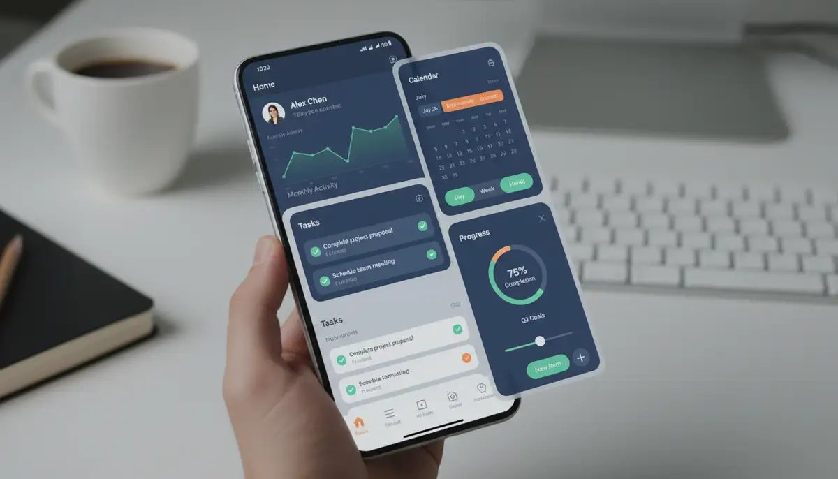
Scrollable Flutter Design Widgets for Dynamic Content
Most applications need to display more content than can fit on a single screen. Flutter provides excellent scrollable flutter design widgets to handle this gracefully.
ListView and GridView: Lists and Grids
- ListView: The most common way to display a scrollable, linear list of widgets. It's highly optimized for performance, only rendering items that are currently visible on screen.
- GridView: Displays items in a 2D scrollable grid. Ideal for photo galleries or product catalogs. You can control the number of items per row or column.
Both `ListView` and `GridView` offer builders (`ListView.builder`, `GridView.builder`) for creating long lists efficiently. This is crucial for apps with dynamic content. They are key flutter design widgets for displaying data.
SingleChildScrollView: Simple Scrolling
If you have a single widget (or a small column of widgets) that might overflow the screen, `SingleChildScrollView` is your solution. It makes its child scrollable. It's simpler than `ListView` when you don't need the list optimization features. It's a handy tool for ensuring all your flutter design widgets are accessible.
CustomScrollView and Slivers: Advanced Scrolling
`CustomScrollView` provides more advanced scrolling effects. It combines multiple scrollable areas and effects into a single scroll view. Its children are called 'slivers'. Slivers are portions of a scrollable area. They can implement custom scroll effects, like collapsing app bars or expanding headers. Mastering slivers allows for highly custom and visually rich scroll experiences with flutter design widgets.
Building Custom Flutter Design Widgets
While Flutter provides a vast array of built-in flutter design widgets, you will often encounter situations where you need something unique. This is where custom widgets come in. Creating your own widgets allows you to encapsulate complex UI logic and reuse it throughout your application. This promotes code cleanliness and consistency.
You create custom widgets when you want a custom look and feel for your app. You also create them when you know a particular widget will be repeated. For a detailed guide on this, explore how to create custom widgets in Flutter. This practice is fundamental for scalable and maintainable Flutter applications. Custom flutter design widgets are key to truly unique app experiences.
State Management with Flutter Design Widgets
As your application grows, managing the state of your `StatefulWidget` instances becomes more complex. Flutter's reactive nature means that when state changes, widgets rebuild. Efficient state management ensures your app remains performant and easy to debug. Several popular solutions exist for managing state across your flutter design widgets:
- Provider: A simple, yet powerful solution for dependency injection and state management. It makes state accessible to different parts of your widget tree.
- BLoC/Cubit: Business Logic Component. This pattern separates business logic from the UI, making code more testable and organized. It uses streams to manage state changes.
- Riverpod: A reactive caching and data-binding framework. It's a provider-based solution that aims to be safer and more testable than traditional Provider.
Choosing the right state management solution depends on your project's complexity and team preferences. However, understanding how state affects your flutter design widgets is paramount.
Responsive Flutter Design Widgets for Every Screen
In 2025, users access apps on a myriad of devices. These include phones, tablets, foldables, and web browsers. Your app needs to look great and function perfectly on all of them. Responsive design is not just a 'nice-to-have'; it's a necessity. Flutter provides excellent tools to achieve this with its flutter design widgets.
- MediaQuery: Provides information about the current media (e.g., screen size, orientation, pixel density). You can use this to adapt your UI based on device characteristics.
- LayoutBuilder: Allows you to build different widget trees based on the parent widget's constraints. This is incredibly powerful for creating adaptive layouts.
- AspectRatio: Ensures a widget maintains a specific width-to-height ratio, useful for images or video players.
- Flexible and Expanded: Used within `Row` and `Column` to distribute available space among children. They help widgets 'flex' to fill space.
By combining these flutter design widgets and techniques, you can ensure your app provides an optimal experience regardless of the screen size. This approach makes your application future-proof.
Enhancing User Experience with Animations
Animations add polish and delight to your applications. They guide the user's eye and provide feedback. Flutter's animation framework is powerful and flexible, allowing you to create stunning motion with your flutter design widgets.
- Implicit Animations: These are simpler to use. Widgets like `AnimatedContainer`, `AnimatedOpacity`, and `AnimatedPositioned` automatically animate changes to their properties. You just provide the start and end values, and Flutter handles the transition.
- Explicit Animations: For more complex or custom animations, you use `AnimationController` and `Tween`s. This gives you fine-grained control over the animation's lifecycle and values.
- Hero Animations: A beautiful effect where a widget 'flies' from one screen to another during a navigation transition. It creates a sense of continuity and elegance.
Incorporating animations thoughtfully can significantly elevate the perceived quality of your application. They make interacting with flutter design widgets a more engaging experience.
Best Practices for Working with Flutter Design Widgets
To build high-quality, maintainable, and performant Flutter applications, follow these best practices when using flutter design widgets:
| Best Practice | Description | Benefit |
|---|---|---|
| Keep Widgets Small and Focused | Each widget should ideally have a single responsibility. Avoid creating 'god widgets'. | Improves readability, reusability, and testability of flutter design widgets. |
| Use `const` Widgets Where Possible | Mark widgets as `const` when their constructor arguments are constant. Flutter can then optimize their rebuilding. | Significantly boosts performance by preventing unnecessary rebuilds. |
| Separate UI from Logic | Keep business logic out of your UI widgets. Use state management solutions for this. | Makes code easier to test, maintain, and scale. |
| Leverage Themes | Define consistent styles (colors, fonts, text styles) using `ThemeData`. | Ensures a consistent look and feel across your app and simplifies styling changes. |
| Comment Your Code | Explain complex logic or unique widget configurations. | Helps other developers (and your future self) understand your code faster. |
Adhering to these practices will lead to a more robust and enjoyable development process. It also ensures that your flutter design widgets are efficient.
Optimizing Your Flutter Design Widgets for Performance
Performance is paramount for a smooth user experience. Flutter is fast, but inefficient widget usage can still lead to jank. Here are some tips to optimize your flutter design widgets:
- Minimize Widget Rebuilds: The most crucial optimization. Use `const` constructors, `Provider` for targeted updates, and `ChangeNotifierProvider` with `Consumer` to only rebuild necessary parts of the tree.
- Use `Keys` for State Preservation: When adding, removing, or reordering collections of stateful widgets, `Key`s help Flutter efficiently identify and preserve their state.
- Lazy Loading Lists: Always use `ListView.builder` or `GridView.builder` for long lists. They only create widgets for items currently visible on screen, saving memory and CPU.
- Avoid Unnecessary `setState()` Calls: Only call `setState()` when the state actually changes and needs to trigger a UI update. Calling it excessively can cause performance issues.
By being mindful of these points, you can ensure your applications built with flutter design widgets run smoothly, even on less powerful devices. This provides a better experience for all users.
The Future of Flutter Design Widgets in 2025
As we move further into 2025, the Flutter ecosystem continues to evolve rapidly. We can expect even more sophisticated flutter design widgets and tools. The focus will likely be on enhanced developer productivity, deeper integration with AI, and even more seamless cross-platform experiences. The community-driven nature of Flutter means innovation is constant. New packages and libraries for custom flutter design widgets appear regularly, pushing the boundaries of what's possible. Keep an eye on official announcements and community projects to stay ahead.
Your Widget Journey with Widgetopia
Understanding and mastering flutter design widgets empowers you to build incredible applications. Just as Flutter allows developers to create custom app experiences, platforms like Widgetopia empower users to personalize their digital spaces. Widgetopia offers a massive collection of over 100,000 free home screen widgets for iPhone, iPad, and Android. You can remix existing designs or create your own, much like designing with Flutter's flexible widget system.
Whether you are building complex business applications or simple, aesthetic enhancements, the principles of good widget design apply. For example, if you're interested in crafting visually appealing home screen elements, you might find inspiration in our comprehensive guide to aesthetic green widgets. You can also discover innovative green widgets ideas to spark your creativity. While companies like widgetsmith.app, colorwidgets.app, and Aesthetic Widgets offer great solutions, Widgetopia focuses on giving you unparalleled freedom and a vast library to express your unique style. Our platform is designed to make personalization easy and fun, just as Flutter makes app development powerful and enjoyable.
Conclusion
Flutter design widgets are the heart and soul of every Flutter application. They provide an incredibly flexible, powerful, and intuitive way to build user interfaces. From basic layout widgets to complex custom components, mastering these building blocks is essential for any developer in 2025. By understanding the types of widgets, best practices, and optimization techniques, you can create performant, beautiful, and responsive applications that delight users. Keep experimenting, keep learning, and keep building amazing experiences with Flutter's incredible widget ecosystem!